Make a cake instead of a cookie: HTML5 game graphics approach

“Oh… graphics in this game looks awesome. It’s like a chocolate cake that I want to eat at once!”
Every designer dreams to hear such words. It would be great to make HTML5 games with fantastic graphics, and dynamic animations. But during creation process we are still facing one problem. We are aware of a fact of low performance, and until for now we cannot do much about it. Compression, frame rate counters may help. But in the whole process of optimization, do we need to limit the design to very simple, and sometimes ugly graphic? No.
Looking through various portals with HTML5 games, I noticed that lots of those games have been done within days, or hours. Same comes for the graphic art in most cases. Ask yourself a question: will those games be successful enough to bring a dream money, or at least a profit that allow you to continue games development? I believe not in many cases, and not in a range we could expect. Of course many developers may think about their games as a fun of development itself without specific commercial approach. But since we are focusing here on serious , business topics, lets face the problem, and try to check different approaches.
First, serious issue, the performance and animations. Instead of wondering that we can’t animate the characters as we want to, let’s focus on static pictures that will show depth of game.
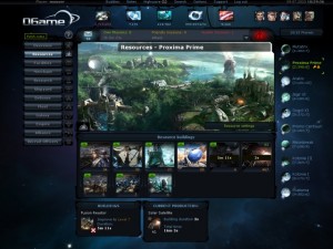
Do you remeber OGAME for PC? Do you remeber how many hours have you, or your friends spent in it, without even thinking: “Oh, come on man, where are 3D effects, where are animation, and lights?”. No, you just saw nice static pictures, perfectly and clearly created UX and menus. That was the “magic” of graphics, the atmospheric art and proper placement of action buttons. With the inside algorithms, and entertaining, addictive gameplay, you were taken to different reality for long hours. Hardcore players, who enjoy cooperation, PvP, or strategy games will go for it, and they won’t really wonder about lack of animations. HTML5, web based game with crossplatform features, and nice, static art is one of the best ways to go, I believe.
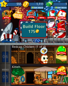
 Now let’s put that idea to a mobile game with HTML5 code, and CSS3 based graphics. A mobile web game can as well work fine without extra effects, and with low number of animations. In my opinion one of best mobile web based social games is PET HOTEL. Take a look at it. The graphics are cool, simple and understandable. The pets are nice, adorable, and you feel you would like to cuddle them all
  That’s the idea! You may follow this approach, or create a lovely art for a strategy, or cooperative game as I showed you above.
Those two examples show one, important feature of graphics: building emotions. Both games don’t need amazing effects. Atmospheric art, cuddle creatures, with well balanced, addictive gameplay is enough, and for mobile browser game it will work just great. Make a cake with strawberries, chocolate, cream and a cherry on top, instead of cookie, which may be small, boring and not attractive. Many publishers will point you that out. When you create a game, the first thing they will look before playing, is graphic design. The game may be interesting, but in most cases the graphic will affect the final decision.
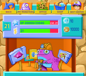
We’ve put this approach into our upcoming production “Monster Keeper“. We did our best to create lovely creatures surrounded by nice environment, clear UX and balanced gameplay, where you will have to reach certain goals. Hopefully this approach will pay off. As a sneak-peak, check out the example part of game design. Do you think you will like it? For us is like mentioned cake, and it has to be tasty!
There is also another approach we used. It proves that waking up emotions in players minds is crucial. In his article, Nicholas Lovell tells us about “Pizzazz“, the emotional feedback from clicking buttons which give player a fun and enjoyment of reward. As he says, an example game “My horse” didn’t seem to have very well finished buttons, but what happens after you click them, makes player happy of playing it! It works like magic. Player doesn’t know what happens when he presses a button, or achieves a goal before he does it. And that’s the beauty of it.
During the process of designing the game, polishing buttons and other graphic elements is also important. They need to be visible, and “clickable”. Since the beginning of my article I tried to prove that we need to focus on quality. I’m basing my approach from a view of player, or publisher. They are the final judges of our game, and first thing they will see is the game design. After that they will start playing the game if they feel it is attractive. I believe that we may get what we are looking for, if we will mix “pizzazz” with attractive design. Make a team “mind storms” over the design, and ask them how they feel it, make tests, focus on they way a player would feel with your changes. Watch out for performance, quality, and little animated add-ons. I believe that we can create really nice games this way. They may be successful, and what’s most important attractive for anyone who looks at them. Because the first sight always matters.
Image courtesy of [posterize] / FreeDigitalPhotos.net
Game graphics in courtesy of OGAME, SOFTGAMES.


